Primary University Logos
Primary Lock-up: Two-color, One-color, Clear Space, Minimum Size, Single-line Wordmark, Pacific P, Official Seal
Official Logo
The University of the Pacific wordmark has been specifically configured and should be considered as a single graphic, not a typeface. The primary University logo is the preferred logo for use whenever space allows.
For advice on wordmark usage or approval, please contact the office of University Strategic Communications

Wordmark: One-color
Pacific Orange

Wordmark: One-color
Pacific Black

Wordmark: Reversed
White with Pacific Black background

Clear Space
The Pacific wordmark must be surrounded by a clear space at least equal to the cap height of “University of the” or “x”. The clear space is measured from the top right, left and bottom-most points of the wordmark.
As a general rule, more clear space is always preferred. No other competitive design elements may be positioned within this space, including typography.

Minimum Size
FOR PRINT
Primary Wordmark: The words “UNIVERSITY OF THE” cannot be less 7 points with a minimum logo width of 1 inch.
FOR WEB OR VIDEO
Primary Wordmark: The words “UNIVERSITY OF THE” cannot be less than 125 pixels.
There are no maximum size limits, however, all design elements of the logo must appear intact and in place.
Minimum size for print. (Samples not to scale)

Minimum size for digital. (Samples not to scale)

Single-line Wordmark
The single-line wordmark is an alternate option to the Pacific wordmark should be used in applications where a horizontal wordmark is more appropriated.
MINIMUM SIZE FOR PRINT
The minimum allowable reproduction size for the single-line Pacific Wordmark is 2” inches wide for print and 180 pixels for digital.
CLEAR SPACE
The single-line wordmark must be surrounded by a clear space at least equal to the height of the letters in “University” or “X”. As a general rule, more clear space is always preferred. No other competitive design elements may be positioned within this space.
Primary Single Line: Pacific Orange

Primary Single Line: Pacific Black

Primary Single Line: Reverse

Single-line minimum size: not to scale
2" inches for print. 180 px for digital.

Pacific P
The Pacific “P” is a highly stylized graphic element. It combines an iconic “P” (using the primary brand typeface) for Pacific with frenetic lifestyle photography.
The “P” should be locked up with cutout photography or inversely can be filled with a photographic element, but it should always break the form of the “P” in some way.
The mark should never be coupled with imagery that falls outside of brand guidelines and the mark itself should never be recreated or reproduced in any other typeface. Discretion should be used wisely when choosing proper images for use. i.e., if an element is cut off on one side, it must align with the P’s letter form, or if an image is used to be housed within the “P,” it should fill the entire letter form.
For advice on wordmark usage or approvals, please contact the office of University Strategic Communications

Our Seal
UNIVERSITY SEAL
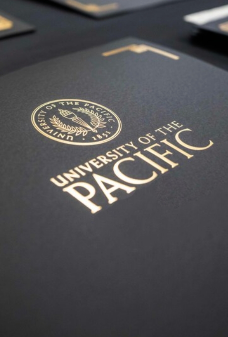
Any collateral, document or piece of merchandise that displays the seal is stating that this material has been officially sanctioned by the University of the Pacific. The seal functions as the official signature of the university, it must NOT be altered in any way.
The seal may be used in conjunction with the Pacific Wordmark or on its own. The seal should never be used extraneously to fill space or to create a pattern.
COLOR REPRODUCTION
The Pacific Seal should only be reproduced in one color. The positive elements of the seal are line art—colors and textures should NEVER be applied into its negative areas. Color usage should never compromise legibility.
