
Typography
Primary, Secondary, Tips, Minimum Size
Primary and Secondary Typefaces
Just as we choose different words to convey different messages, the typography we use can have a profound effect on our communications. Consistently using the official fonts selected for Pacific strengthens and reinforces the brand.
Typefaces available through Adobe Fonts.
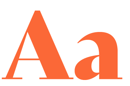
Primary: Bely Display + Family
Bely Display Bely Regular Bely Italic Bely Bold Bely Bold Italic
Secondary: Neuzeit Grotesk
Neuzeit Grotesk Light Neuzeit Grotesk Regular Neuzeit Grotesk Bold Neuzeit Grotesk Black


Tips
LABEL TEXT
Neuzeit Grotesk Black is the only font label text should appear. It must always be in ALL CAPS and have appropriate tracking for legibility.
HEADING
Bely Display is the only font that should ever be used for headlines.
UNDERLINE
Underlines should be used sparingly as a vehicle to show extra emphasis specifically on one word of a headline. The underline should always follow the proportions shown on this page. It should also always either be Pantone 282, 165, or 419 C.
SUB-HEADING
Sub-headings should appear in Bely Regular or Bely bold, never Bely Display. It may also appear in the Neuzeit Grotesk font family, but in either font, it must always be in sentence case, never ALL CAPS
PARAGRAPH TEXT
Paragraph text should primarily appear in the Neuzeit Grotesk font family but may also appear in Bely Regular or Bely bold, never Bely Display. With use of either font, it must always be in sentence case, never ALL CAPS. Bold text should only appear when you’d like to emphasize something of importance within paragraph text. It should not be used for the entire paragraph.
Minimum Size Requirements
Text examples shown here are the minimum size requirements for each text style to reach best possible legibility in design in print and web applications. The size of text will differ drastically depending on the size of the application, but text styles should never appear smaller than shown on the example below.
LABEL TEXT
Neuzeit Grotesk Black
5 pt. type / 6 pt. leading +425 tracking
HEADING
Bely Display
18 pt. type / 20 pt. leading -10 tracking
UNDERLINE
BELY DISPLAY (UNDERLINE) Weight: 7pt. / Offset: 5 Stroke: solid
SUB-HEADING
BELY REGULAR 12 pt. type / 13 pt. leading +25 tracking
PARAGRAPH TEXT
NEUZEIT GROTESK BOLD & LIGHT 8 pt. type / 11 pt. leading default tracking