
Colors
Primary, Secondary, Neutral
Color Palette
PRIMARY
Pacific’s primary color palette consists of orange and black. When coupling these colors with accents of secondary and tertiary color palettes, Pantone 165 should always take priority in hierarchy.
COLOR VALUES
• Pantone is for professionally-printing. • CMYK is for litho and digital printing. • RGB is for digital communications.
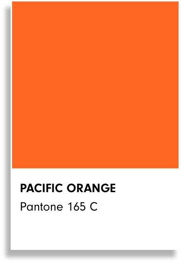
PACIFIC ORANGE
Pantone 165 C CMYK: 0, 74, 95, 0 WEB: #FF671D RGB: 255, 103, 29
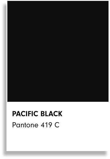
PACIFIC BLACK
Pantone 419 C CMYK: 86, 70, 69, 95 WEB: #0F0F0F RGB: 15, 15, 15
Alternatives to Pacific Orange and Pacific Black
The alternative orange pantones should not replace the primary orange, but can be used to accent it when darker shades are necessary.
Pacific Navy (Pantone 282) should be used when the black feels too heavy in a composition. Using the navy, while dark, will bring a friendlier tone to a design versus using black.
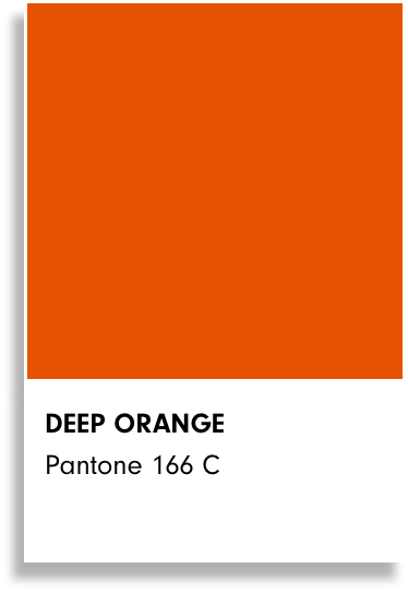
DEEP ORANGE
Pantone 166 C CMYK: 5, 82, 100, 0 WEB: #E65300 RGB: 230, 83, 0
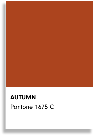
AUTUMN
Pantone 1675 C CMYK: 23, 84, 100, 15 WEB: #AC441E RGB: 172, 68, 30
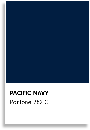
PACIFIC NAVY
Pantone 282 C CMYK: 00, 87, 42, 52 WEB: #011E41 RGB: 1, 30, 65
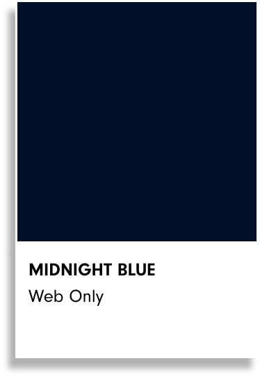
MIDNIGHT BLUE
Web Only WEB: #001028 RGB: 0, 16, 40
Secondary Colors
Pacific’s secondary color palette helps diversify and broaden our use of color and add different emphasis and emotion to our brand’s image. These colors should always appear along with the primary color palette in some form of incorporation. Darker shades of the accent colors have been incorporated into the palette to accompany the pantones only when necessary for things like adding variation or ADA compliance where necessary.
Secondary Color
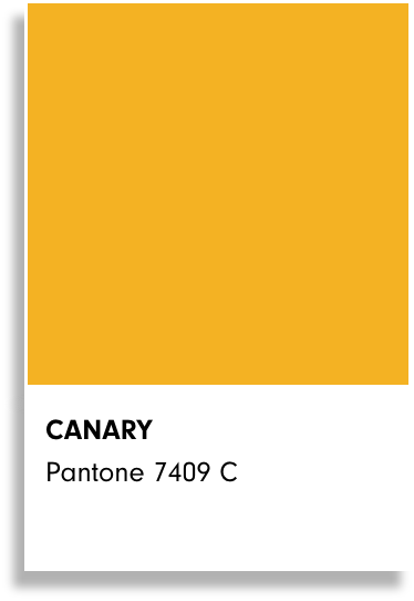
CANARY
Pantone 7409 C CMYK: 3, 32, 98, 0 WEB: #F4B223 RGB: 244, 178, 35
Shade
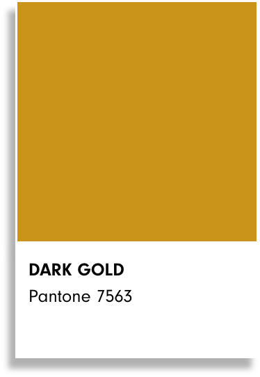
DARK GOLD
Pantone 7563 CMYK: 7, 35, 99, 19 WEB: #C99419 RGB: 201, 148, 55
Secondary Color
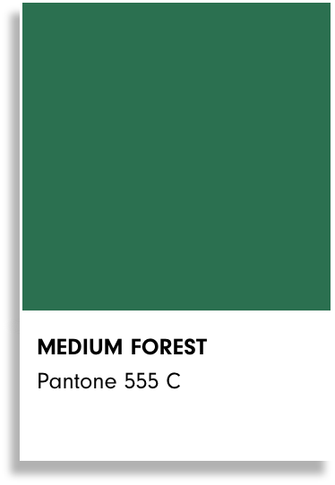
MEDIUM FOREST
Pantone 555 C CMYK: 83, 33, 77, 21 WEB: #2B7050 RGB: 43, 112, 80
Shade
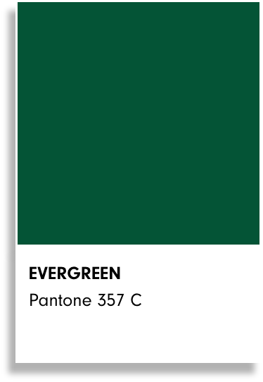
EVERGREEN
Pantone 357 C CMYK: 92, 18, 94, 61 WEB: #045436 RGB: 4, 84, 54
Secondary Color
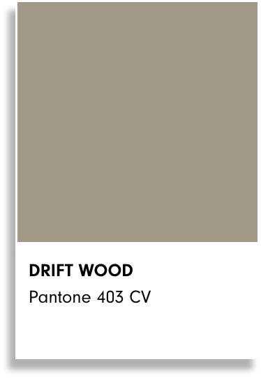
DRIFT WOOD
Pantone 403 CV CMYK: 38, 35, 45, 2 WEB: #A29889 RGB: 162, 152, 137
Shade
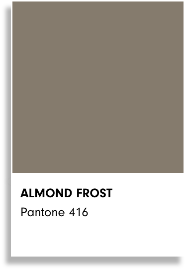
ALMOST FROST
Pantone 416 CMYK: 20, 25, 30, 59 WEB: #857B6D RGB: 133, 123, 109
Neutral Colors
Neutral colors are necessary to help balance and give your eye a rest from color. Additionally, the full spectrum of white to the Pacific Black is acceptable and encouraged for use in designing for the brand.

WHITE
WEB: #FFFFFF RGB: 255, 255, 255,
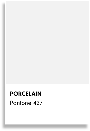
PORCELAIN
Pantone 427 CMYK: 7, 3, 5, 8 WEB: #F2F2F2 RGB: 242, 242, 242
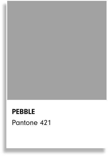
PEBBLE
Pantone 421 CMYK: 19, 12, 13, 34 WEB: #A2A2A2 RGB: 162, 162, 162

PACIFIC BLACK
WEB: #0F0F0F RGB: 15, 15, 15